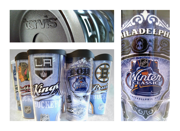
I wasn’t too familiar with Tervis so the first thing Deb, the art director, did was send me samples to help familiarize me with their products. These designs are printed on acetate, which they refer to as wraps (as they wrap around the tumbler). The construction of the tumbler consists of two separate parts, an inner and outer shell. The printed acetate is placed in between these parts before being magically fused together. Deb also gave me product that were already personalized with my name and my favorite NFL team, the Redskins… HAIL! These tumblers are pretty impressive. It keeps your drinks cold (or hot) longer than typical drinkware (which my Kettle and Cran greatly appreciate) and they’re practically indestructible.
After reviewing the project with Deb, the direction was wide open. The only requests were to use the Bruins as the sample team, make sure the design covers only 50% of the wrap (so the liquid inside is viewable) and to have the main image be the team logo (with the dimensions being 3.5″ wide – the visible front area of the tumbler). After some research and brainstorming I had three ideas with distinctly different directions to choose from:
- Center Ice – Design the main graphic (team logo) to have a cool treatment: an under-the-ice look. I wanted to play off the contour of the 24 oz. tumbler with athletic stripes (which easily color shifts for different teams). Finally, with the product being clear, use that as a design element with an ice texture.
- Beer Stein – With the target audience mainly men, and this being a collectible decorative drinkware project… how could you not want a design inspired by beer steins? I wanted to find a middle ground of not being too decorative (like traditional steins) and to maintain a sports feel. Also, I wanted to do a play on words by using terms that fit both hockey and beer. After some Wikipedia help, I came up with “Top Shelf” and “Full Strength”.
- Goalie Mask – The last idea was to use a goalie mask. Why? Simply because it’s one of the coolest sports equipment there is (that and those bowler’s wrist guard thingies). And with the shape (cylindrical) of the tumbler, I wanted the design to create a 3-D effect. I even thought of having the logo inside the mask to give it more depth.
Below are second round comps that I took with my iPhone camera (Center Ice, Beer Stein and Goalie Mask). I’ve always found it to be good practice to mock up everything (for sizing, placement and the overall look). Whether you’re designing for packaging, a t-shirt or a tumbler you don’t want any surprises in the final execution. With the tumblers having a bevel (designed to fit in cup holders) I had to adjust the artwork a bit to be sure all the logos and other copy were legible. And being wraps, I had to be sure that the seams lined up perfectly. The Goalie Mask has a net pattern which was tricky to line up due to the curved shape of the template. After about 37 tries, I finally got it. Click image to enlarge.

 The toughest part when designing for a line like this (sports licensed products) is that the artwork needs to be “rolled out” to work for every single team. Does the design work for all the various team colors? How about all the different team and city names? Will the font that you choose work for the “Wild” as well as the “Avalanche”? How about “Philadelphia”, a twelve letter word versus “Dallas” and “Ottawa” with only six? Creating designs that are flexible, team color friendly and fonts that look good stretched or squished all while making it not look too generic (or what I call a “cookie-cutter” design) is the challenge. Below is an image showing the client how the Goalie Mask design would roll out for the different team colors (color shifts). I created two layers in photoshop. The first layer was an adjusted black channel of the goalie mask and the second was the team’s primary color. I set up my file so Tervis’ production designers could just change out the primary team color layer to get the desired effect. And that’s another element to this whole thing… it needs to be production friendly. I think what separates the good designers is the ability to take all these elements (which are different for every project) and cleverly engineer them into their solutions.
 Finally, of the designs that were chosen I created illustrator files that gave instructions and guidelines on how to build and roll out the type for all the teams.
 This was the first project for Deb and Tervis. I still would like to see that Goalie Mask design become a reality… but that’s how it goes. They’ve also asked me to create the line look for both the upcoming seasons of MLB and NFL. Those projects are soon to come!