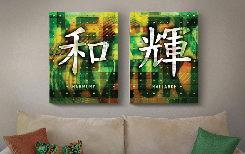
 This was a project for a good friend (and his wife) who wanted a personal piece for their home. The subject matter was their newborn son, Derek. Their idea was to have a typography piece of his name and not the typical baby photo collage… thank goodness. They did have specific color preferences, “colorful, bright and rich but not neon or girly” and also “autumn colors, deep oranges and shades of green”. Derek’s Japanese (middle) name is Kazuki. When written in Japanese Kanji, the first character means peace or harmony and the second character means to shine or radiance. This played a big role in creating the piece. The first image below shows the kanji characters in different fonts. Through my friend I learned that not all fonts clearly represent “Kazuki” and when designing I must maintain their correct forms.
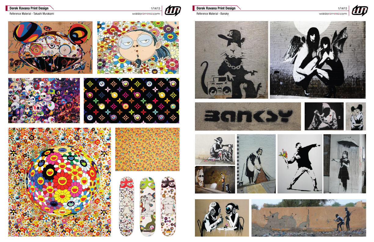
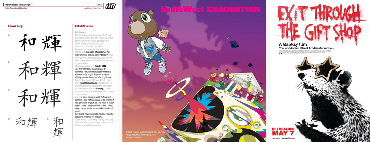 Since this was a very personal piece I wanted the artwork to reflect what they’re artistically drawn to. Their favorite artists are Takashi Murakami and Bansky. So we have a well known Japanese contemporary artist who paints, sculpts and even hooked up the artwork for Kanye West’s Grammy winning album, Graduation. And on the other side of the galaxy, an anonymous political graffiti artist and filmmaker. My first thought was “how am I gonna make this happen?”.
 Once I familiarized myself with some of their work (see references above) I got started. For the execution of this project I thought a diptych piece (2 separate canvases intended to be hung as a pair) would work perfectly.
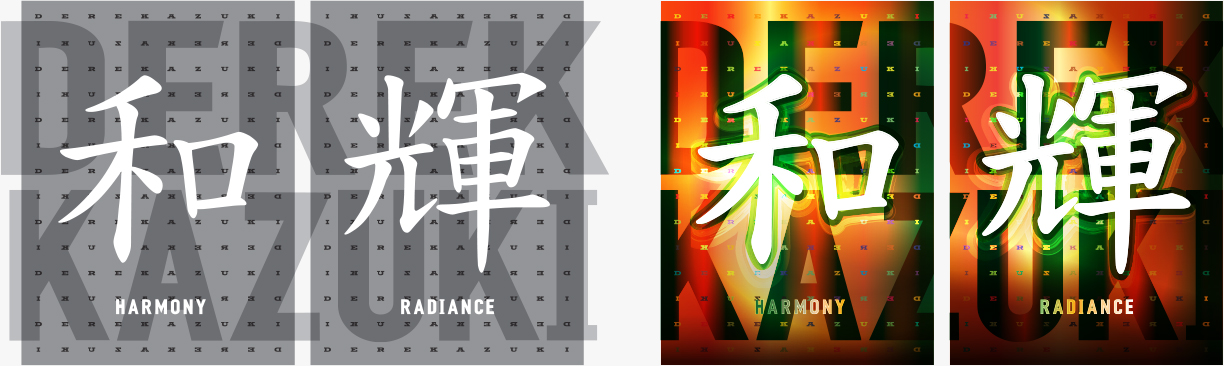 The images above are the final thumb and comp for the project. At this stage I just wanted to show the diptych idea, the layout and the overall colors. The feedback was very positive with some minor color tweaks. I got the nod and was now ready to jump into photoshop.
Seeing Waldo’s work from the past, the only thing certain was I wanted a piece in his style. What we received during the process was much more than his artistic abilities, but also his controlled art direction and innovative idea that built the foundation for the artwork, as well as his capability to listen and interpret our wide array of ideas. Waldo was able to implement all of our thoughts into the work and the finished piece is more than anything we could have imagined.” – Client (and my homeboy), Pat Ravana
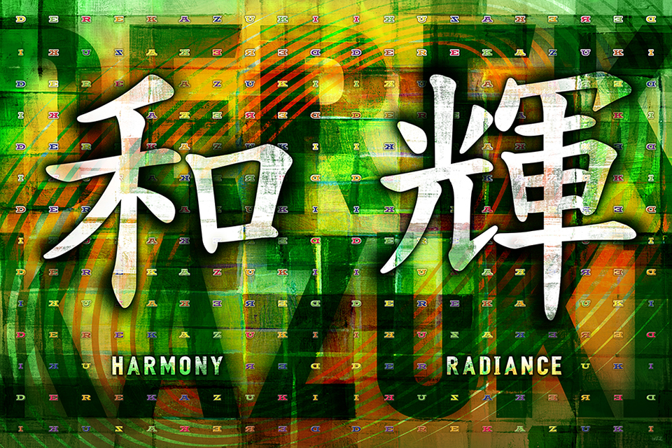 Here’s a look at my working file as one piece. I wanted give the background a loose, organic and painterly feel. I tried to balance the brightness especially against the characters so they would stand out most. The kanji has areas where the canvas texture will be exposed to make them pop. The characters’ shadowing has an “over-sprayed” look for a Bansky feel along with the concrete wall texture. The smaller “DEREKAZUKI” pattern in the background was Murakami inspired. Connecting the “K” with both his names and mirroring this pattern (vertically and horizontally) I wanted to show symmetry and harmony. Also, reading right to left is the Japanese way. Finally, the large “DEREK KAZUKI” and circular lines that radiate outward help tie the two canvases together while symbolizing each character’s meaning.
For many reasons it was a great project to work on. The only downside is now my wife wants one for our two girls. Thanks Pat.
(Final Size: Two canvas panels at 22.5″ x 30″ each)