The brand’s namesake comes from a king who is thought of as the first Filipino hero. The first native to have resisted Spanish colonization he was responsible for the death of explorer Ferdinand Magellan. Also known as Lapu-Lapu, the 1898 Philippine Declaration of Independence refers to him as “King Kalipulako de Maktan”.
The main direction from the creative brief:
- Create an image-driven logo inspired by the Philippine Hawk-Eagle. A distinct characteristic of this bird is it’s feathers predominantly sticking out on top of it’s head.
- The imagery needs to have a “sports logo” feel.
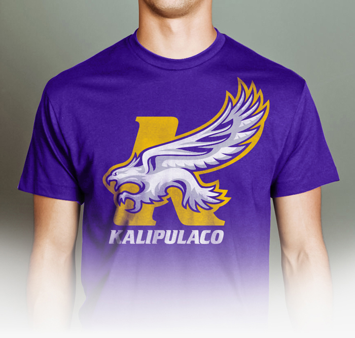
- No specific color preferences as the design needs to be versatile to work with multiple colorways (examples: athletic/lifestyle shoes, sports team colors, etc.). As shown here in the final solution.
- Company’s competition/references: SAVS, Diamond Supply Co., The Hundreds, Black Scale, Obey, and Popular Demand.
- Keywords from the Creative Brief: Clean, edgy, strong, unique, and aggressive.
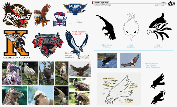 Above are references of the hawk-eagle and the initial sketches for three specific directions: a full body, a straight on view of the head and a head profile. Once we determined we wanted a full body, it was a matter of finding the right aggressive/attacking pose.
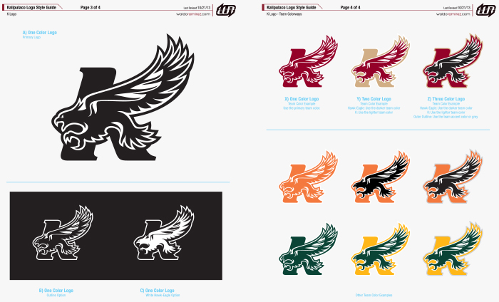
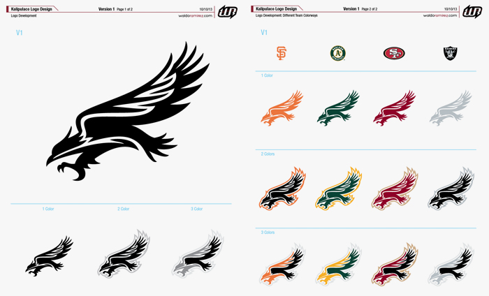
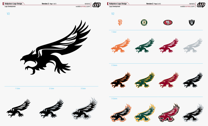
The next two images below two ideas of the bird just before it grabs it’s prey. I also showed various colorways at this stage so the client could get an idea of how these would work for each concept. Freddie chose the second concept but there were still a bit of fine-tuning to do. He also wanted to see a “K” logo variation with the bird integrated.
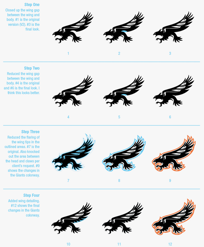
 In the next round, I took Freddie’s detailed instructions and continued to fine-tune the logo. Much of the success of the logo mark would be determined by it’s versatility. I wanted to demonstrate how the logo can be flexible not just in color but also graphically. Below is an example of a simple variation using elements from the Filipino flag.
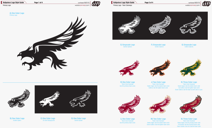
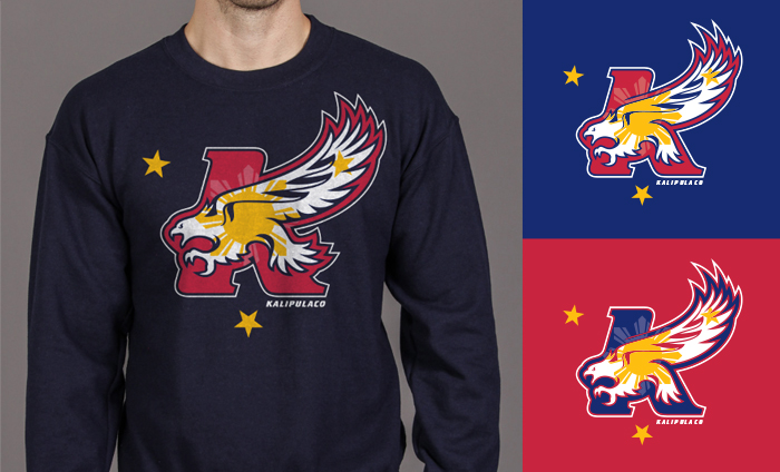 After a few more tweaks the logo was set. We then moved on to the secondary logos. When I built the style guide I included multiple examples of how to use various colorways for each logo. Normally I would suggest limiting color variations to maintain control of the brand. However, with “colorway flexibility” being part of the task I wanted to be sure this element was well thought out.