Having a partnership with USSD the client wanted to establish their own brand identity. And that’s where I came in. I try to create an environment where clients can speak freely, where all ideas are welcomed and clients know it’s a partnership every step of the way. With every project my mission is to deliver the client what they want. I offer suggestions not just on design but what’s the most effective and cost efficient. And with every decision, the client can make the best choice for them. The client had a bunch of ideas of how he envisioned his dream. The new business owner was very involved and receptive to this style of collaboration.
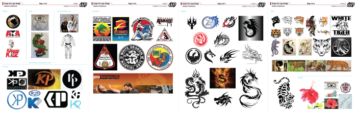
After our initial meeting the first step was to fill out the creative brief. My client also offered up ideas he wanted me to pursue. Below are some sketches and existing logos of ideas he’d had in mind and directions he wanted to stay away from.
-
Two Concepts
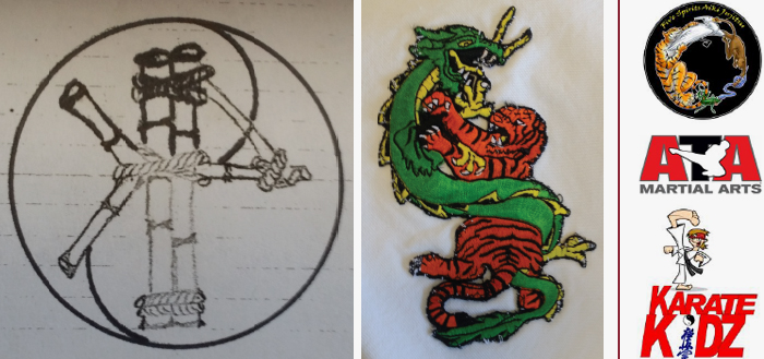
- Client’s sketch: Bamboo that intertwines to create a “KP” monogram.
- Create a modernized version of the traditional “Tiger and Dragon” imagery.
-
Main Points of CB
- Eye-catching yet different from competitors. To reflect the tradition of martial arts but incorporate a modern look.
- Color Preference: Black, red, silver or grey.
- Key Words: Clean, professional, traditional, edgy, strong, unique, integrity and progressive.
-
My References
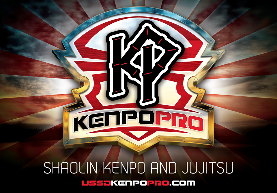
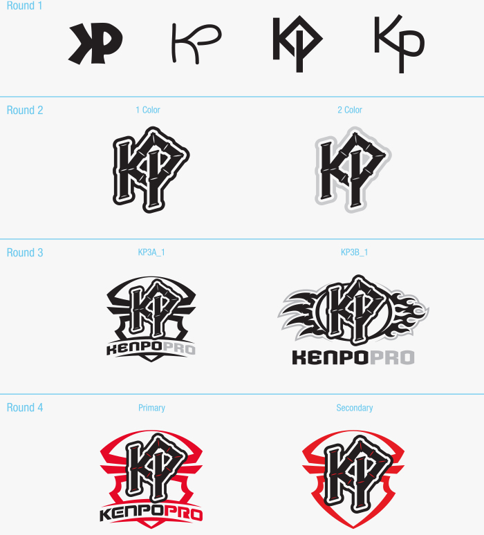
 After some initial sketches and design concepts we moved forward with the “KP” monogram direction. From our conversations Josh wanted a logo that looked traditional yet modern. I used his sketch as inspiration. I designed a shield around the monogram to portray strength and honor. The shield itself was inspired by a torii, a Japanese gate that marks a sacred space. With the shield representing the traditional side I chose a more contemporary font.
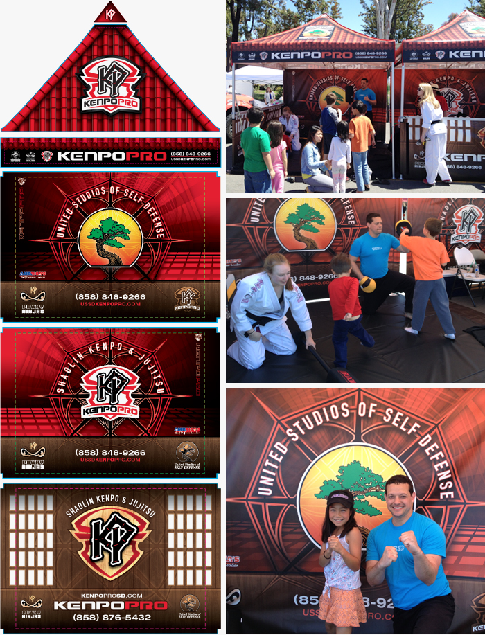
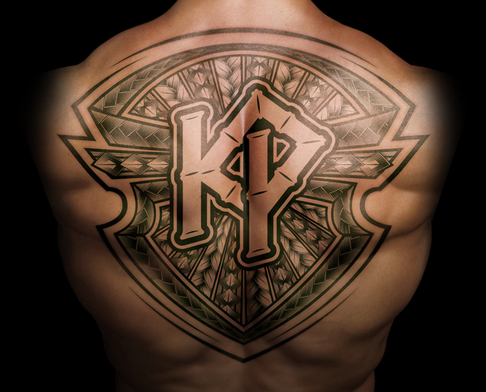
 Once the logo was approved we focused on various marketing and promotional pieces. Along with the traditional business cards, flyers and banners there were other cool projects I got to design. Below are the comps and photos of those projects. It was great to see everything come together. Well, everything except the tattoo.
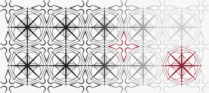
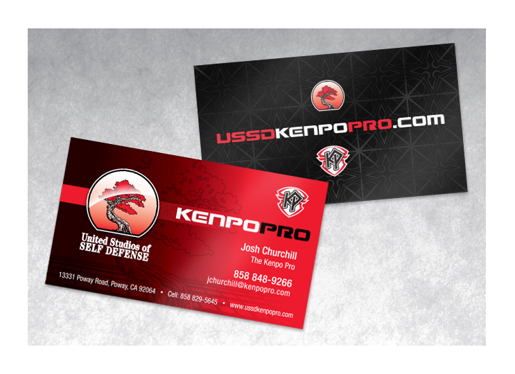
 For the business cards I created a Spot UV pattern that incorporates my stylized version of the universal symbol for Kenpo and a shuriken (ninja throwing star) graphic.
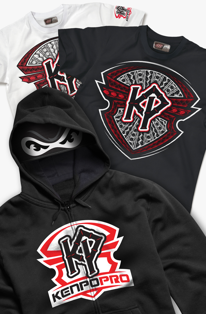
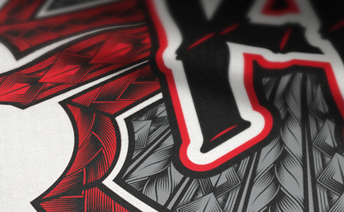
 Below are some apparel ideas that both Josh and I had. He wanted a kids hoodie that includes a mesh face mask with the “Ninja Eyes” art I created for his Poway Ninjas program. For his branded tees, I wanted something that appealed to both his younger and older students. My objective was to create a stylized version of the KP Shield that gave a cool take on the martial arts culture.
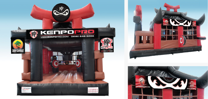
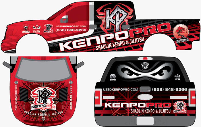
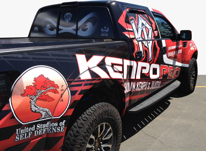
 And then we moved on to the bigger projects. Josh ordered custom bouncers, pop-up tents and an auto wrap for his truck. I had a blast working on these projects. Tentcraft was our vendor for the pop-ups and the did a great job on the execution. A family owned and operated company, 1daywraps, were in charge of the auto wrap. Josh wanted the Poway Ninja Eyes on the back window and thought that added some cool points for the kiddos. After seeing the truck in person it was easily one of my favorite pieces of this project.