InterFocusLaw, LLP is a California-based boutique business law firm offering sophisticated legal counseling to domestic and international clients. They specialize in the digital entertainment and media, clean technology and biotech industries. Their vision for the company is to be perceived as leaders in these technological savvy environments by providing the best legal and business solutions. The co-founders, James and Kenji, renamed their firm and were looking for new branding to reflect this vision.
Main Direction:
- The main criteria in the creative brief was to “convey the message that we are focused on international and internet-related projects”.
- Vibrant colors. Avoid colors like purple, pink, brown, black and orange. Shades of red or green might be ideal but would like it crisp and vibrant.
- Keywords: Progressive, edgy, strong, unique, integrity, hi-tech, precise, fast and efficient.
- Clientele being young, techy and in the gaming world, design a logo that isn’t boring or has a typical law firm look.
 The above images were from my first round (click images to enlarge). When I’m unfamiliar with certain industries, I usually begin my research on the industry, the company itself and their competition. After reviewing the CB, what really stood out were the words “international” and “internet”. I did a google search (law firms, hi-tech, international and internet) to see what’s out there, what I liked graphically and what to avoid. Due to the tight timeframes I went a lot further than usual for this round.
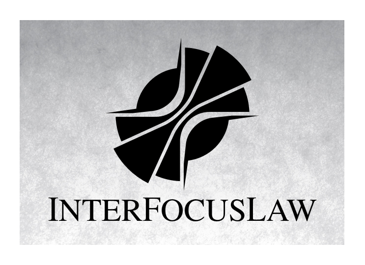
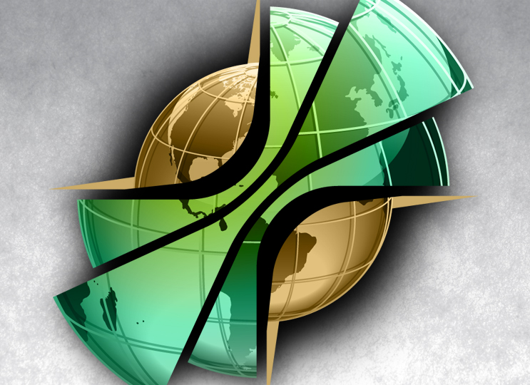
 Of the three directions, they loved the third (the globe logo). The first two (my favs) were simply a merge of two images, the column (for law/legal) and the circuitry (for internet/hi-tech). Visually I thought it just looked cool so I did two versions. The second version I tried to bring it back a bit (for a law firm) by encasing it in a shield/crest to give it a stronger and more authoritative feel. After speaking with the clients though, I quickly changed my mind on my favorite. Kenji said it looked like a “jellyfish”. You know how that goes… after that, that’s all I see. With the globe logo, since there are many out there, this direction took a while. The logo mark was more abstract in concept than the previous. My attempt was to create a world that’s getting smaller (with technology, media, etc.) with the core (InterFocusLaw) being the force that bridges companies together in the proper manner (compass).
 In the next round I took the globe logo further and played with type and color. As I tried with the shield for the jellyfish logo, my plan was to choose fonts that brought it back a bit. Usually it’s the clients trying to reign back the designer. In the end it’s a law firm and I didn’t want the branding to be too “out there” or overly progressive. It needed to communicate a level of seriousness and credibility.
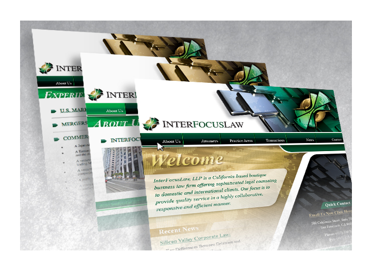
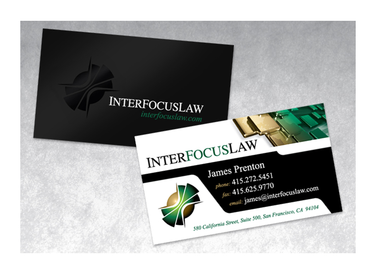
“As part of the re-branding of our law firm, we retained Waldo to create a new logo, design business cards and develop the new “look and feel” for our website. Despite extreme time pressures (we had less than 3 weeks to launch the website), Waldo worked closely with us, our site programmer and other vendors to develop a new look that we were extremely happy with. The process was very efficient from start to finish and with Waldo’s meticulous attention to detail regarding our objectives and work product, we not only ended up with a great website and logo but we learned a few things about how we view our firm, clients and the market as a whole.”– James Prenton, co-founder, InterFocusLaw, LLP