This is a self promo designed specifically for Nixon. This company is ultra-detail oriented, always category-focused and a brand who definitely knows who they are. In such a short time and in a very competitive industry Nixon has become one of the strongest brands for those three reasons. As an art director and a designer I deeply respect and appreciate when a company does it right. I’ve been a fan since 1999 when I saw their watches in Huntington Beach. For me, right means being true to the brand. Always. And if you know and believe in what you are doing and you’re putting out the best products/services with the best people, everything else will come. I created this promo because I’d love to be a part of that.
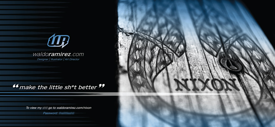
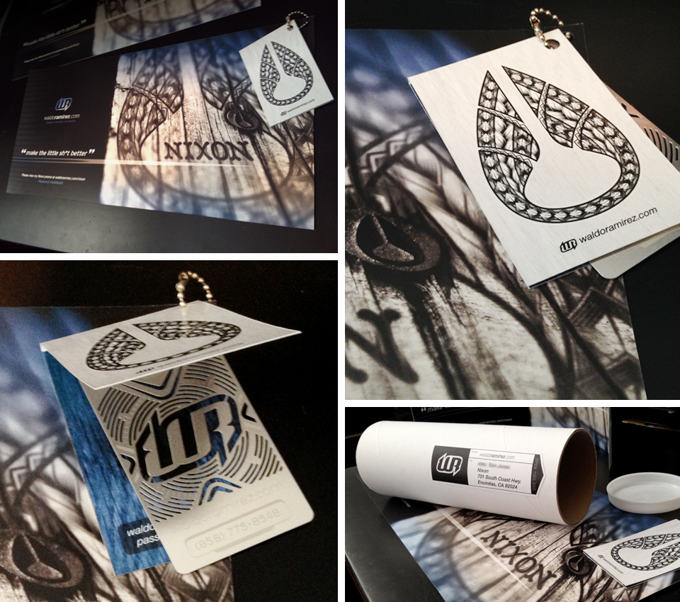 Above are photos of the promotional that I dropped off at Nixon. The piece included a poster (17″ x 8″) with a vertical business card folder attached to the upper right corner with a metal beaded chain. It was rolled up into a mailing tube (3″ in diameter x 9″ tall). Below is the poster itself. Wanting to drive Nixon’s creative group to my site, I created a password protected page. The poster’s headline uses a quote straight from Nixon’s website to tie everything in (hints the language) and has the link and password to view the entire promo.
 The following images below are the pages of the self promotional. You can click on any of the images to enlarge.
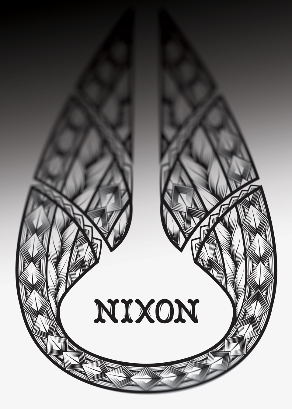
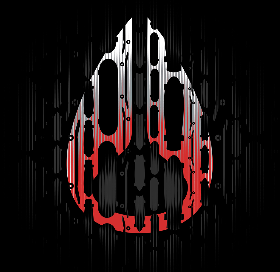
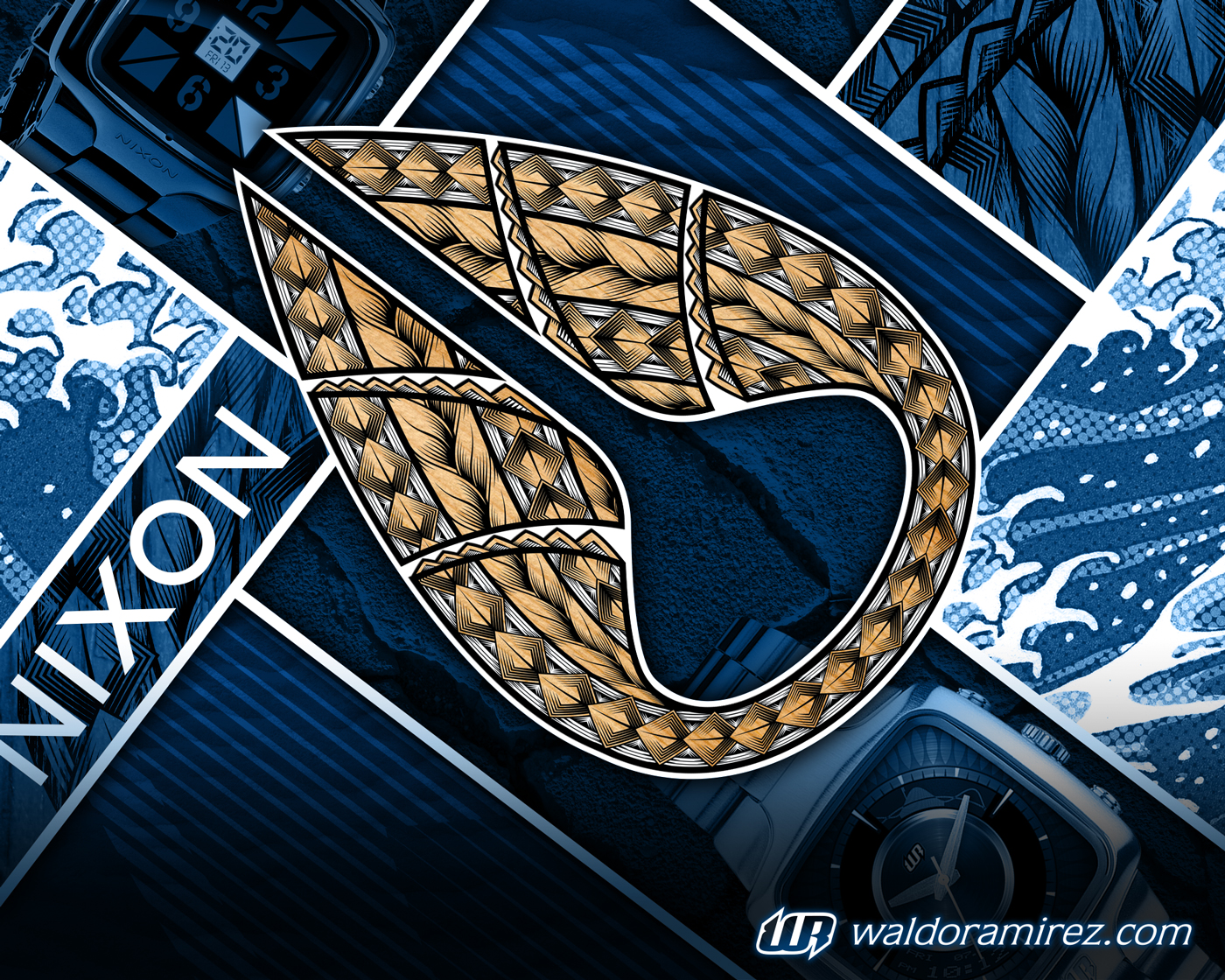 This is the promo’s cover. I used elements of what’s to come. I liked how the tribal tattoo inspired Nixon logo came out, so I used that as the focal point. The feel may be a slight departure from the brand look itself but with this being a promo piece I wanted an image that was striking and would draw the viewer in.
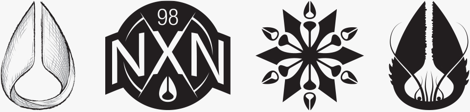
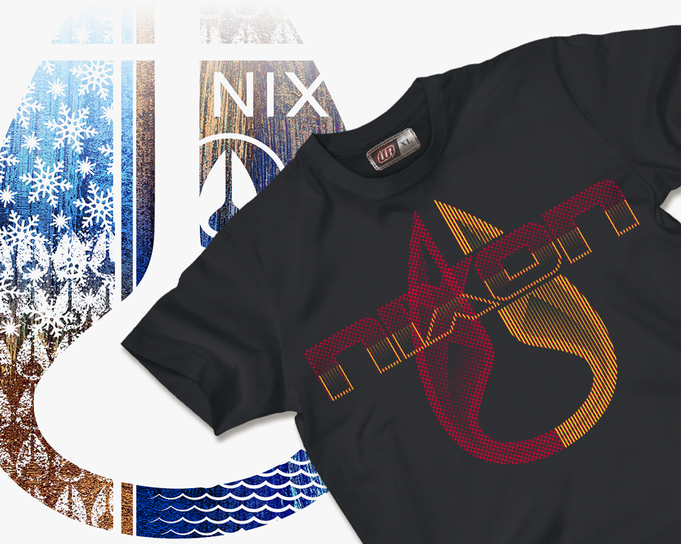
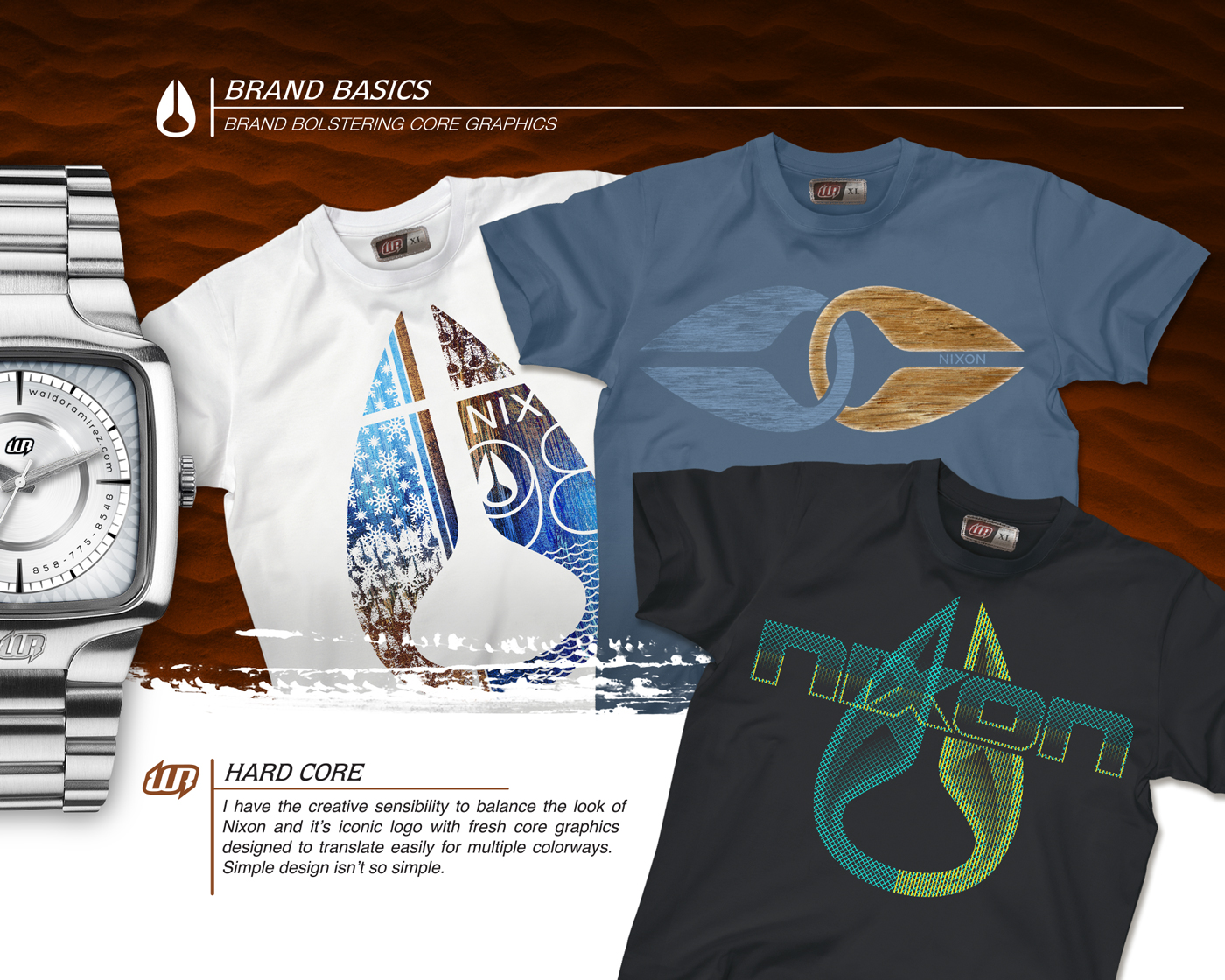 The first page show examples of branded graphics. My direction was to create clean, colorway-friendly designs that are in line with the Nixon brand.
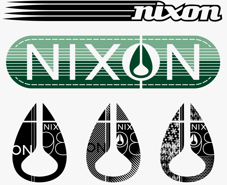
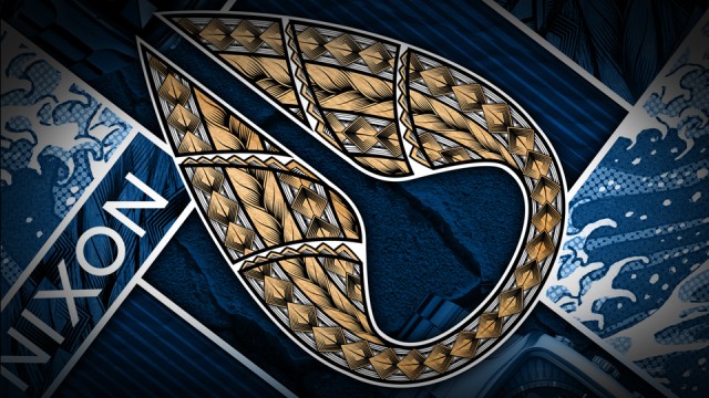
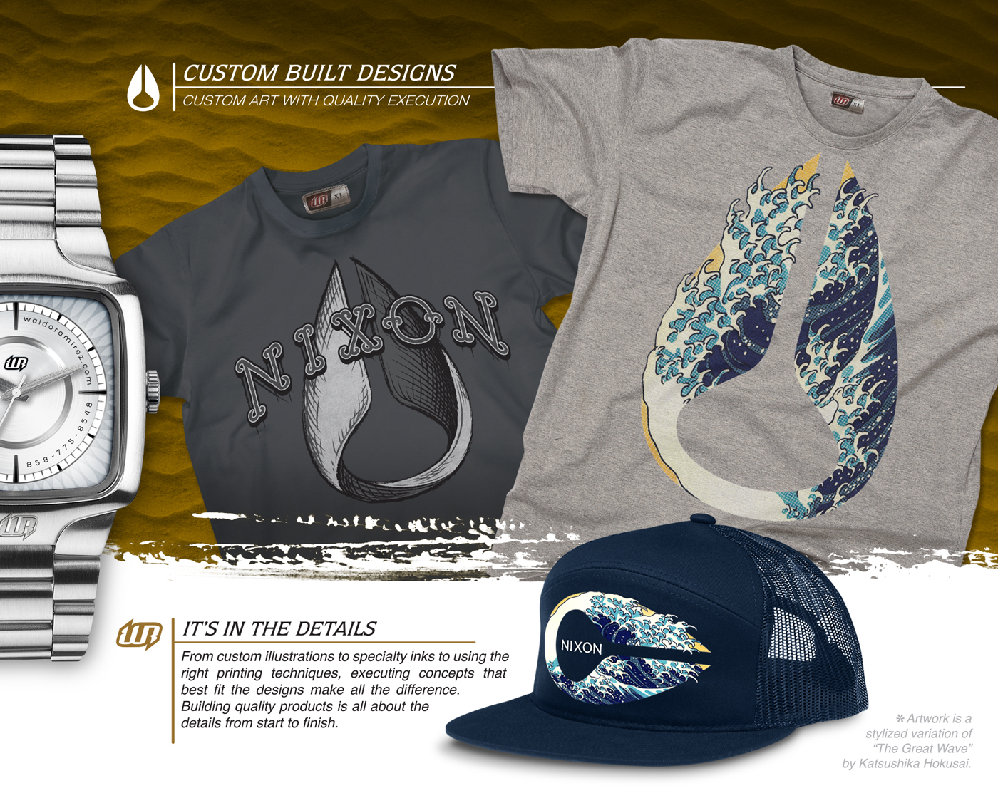 Here I wanted to show a more artistic side. I illustrated a clever twisted Nixon logo that still kept it’s integrity (not altering it’s outer shape). For the second graphic I used the famous “The Great Wave” by Katsushika Hokusai to create a stylized logo. The hat is one of my favorite pieces.
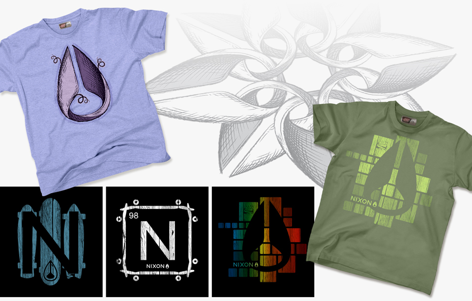
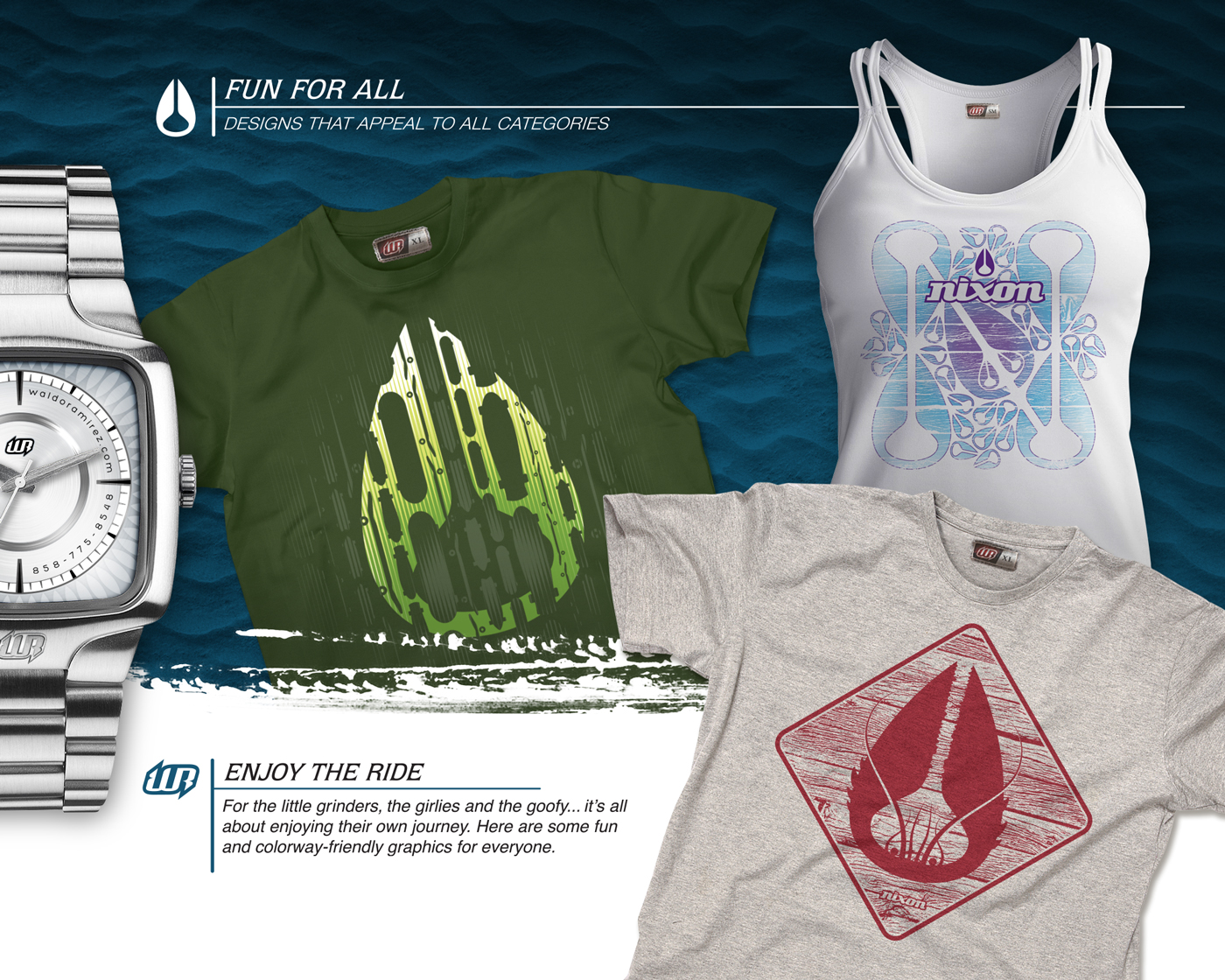 This page was more of a reach in terms of what Nixon does now. They don’t really have kid specific apparel and their womens lines are very basic. Without straying away too much I thought these were some future categories Nixon may explore.
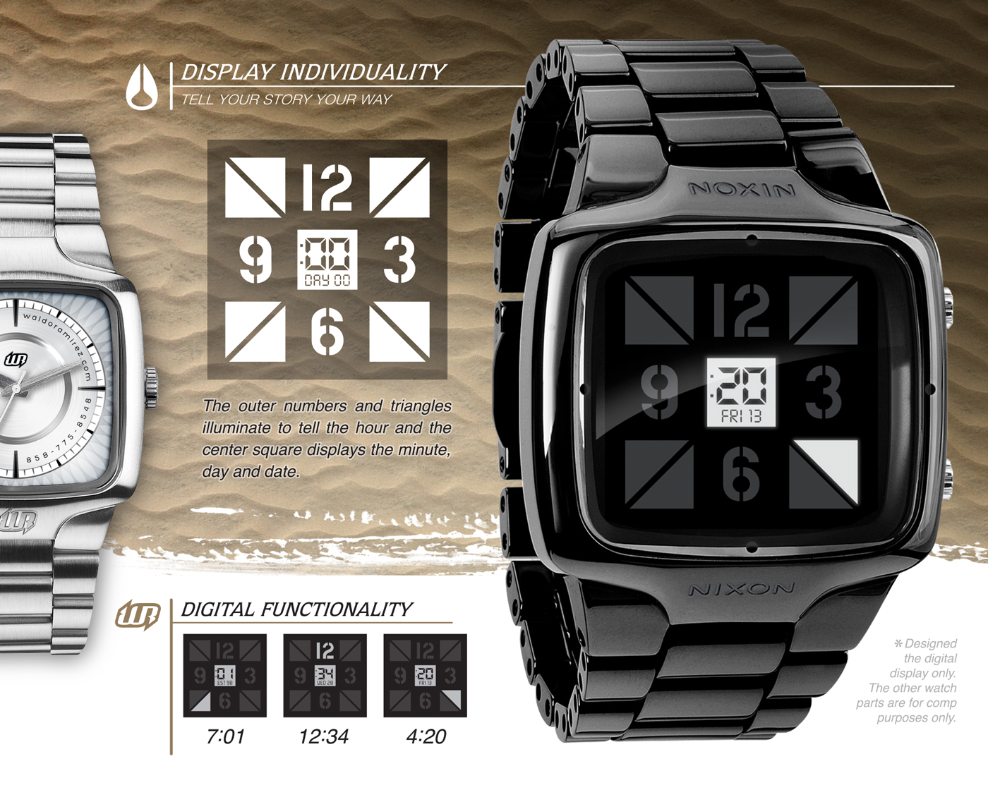 I had some concepts on new ways of displaying time. Everyone does things their own way and here’s a way to express your own unique style. This was an idea combining the traditional with the digital.
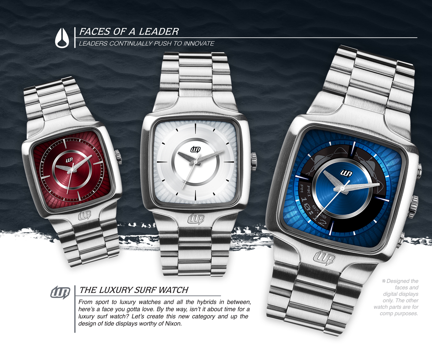 Finally, here are some watch face designs. I’ve always wanted to design watches. I also wanted to take a stab at tide display design. From my research there wasn’t a digital display that didn’t look like it came out of the 70’s. I wanted one that was more integrated with the watch and wasn’t your typical rectangle bar chart. And I figured I do all of this in a new category, the Luxury Surf Watch.
Shaka!
Thanks for viewing.
Want more? Keep scrolling.
Below are some close-ups and additional designs that didn’t make the cut.