For the rebranding of this project Pete, the school’s founder, had a lot of input and specific design criteria. Below are the comments that stood out from the creative brief and initial conversations.
- “A martial arts school that is progressive, modern and innovative yet traditional.”
- “A modern and sleek look to say we are contemporary and traditional.”
- “Would like the tiger in our logo to look updated and blended with our Hawaiian culture.”
- “We like the look and style of the Denver Broncos logo.”

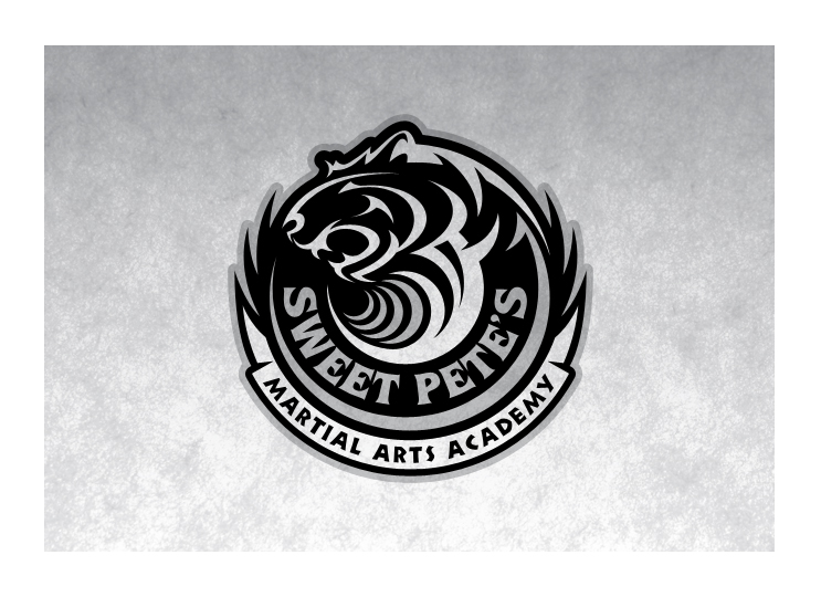
The first thing I attacked was the tiger graphic. Inspired by the Broncos logo I also used the circle tool exclusively to create all the strokes. This gave it some attitude, movement and a nice flow. From my research it seemed that every martial arts logo was in the form of a seal or a crest. To achieve that balance of “progressive/innovative yet traditional” I encased the tiger graphic in a seal layout. With the graphic being more progressive and the layout/presentation more traditional, I thought it helped with the balance of the desired direction. To “blend” the graphic with a Hawaiian element I turned the tiger into a wave which also added to the movement of the piece. Finally, I tried to subtly detail the outer border on the seal with other “Hawaiian” elements.
 After the first round the feedback was very positive. The client chose (V1B) and was so happy with the direction that he said he would take it as is! However, I still needed to fine-tuned the logo so I did another variation and finalized the outer border. With Pete satisfied with the progress thus far I began to explore different colorways at this stage as well. The color variations are in the order of what I preferred. Many of the existing martial arts logos use red, black and yellow. I explored those colors too but my favorites were the first two because they were different and I can picture them standing out in a sea of logos during a martial arts tournament. The green, black and grey version (V2B) was inspired by the team colors of the University of Hawaii, which was a close second (favorite).
 The images below show the original logo, the style that the client asked for (Broncos logo) and my favorite colorways.