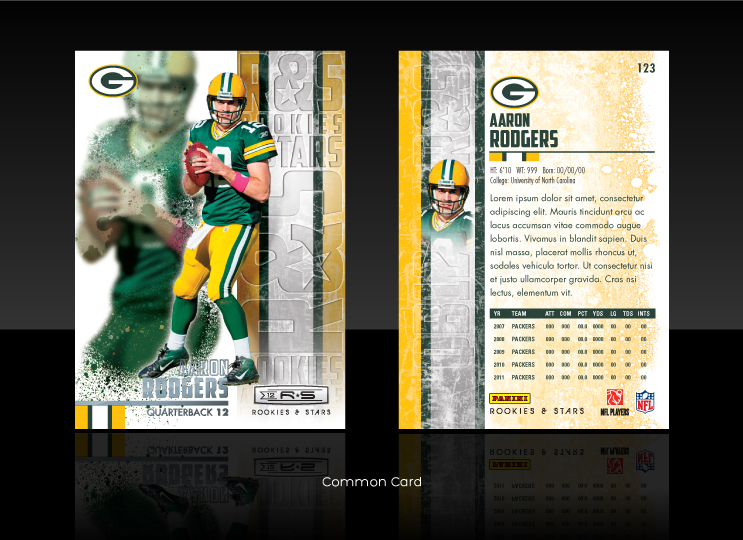
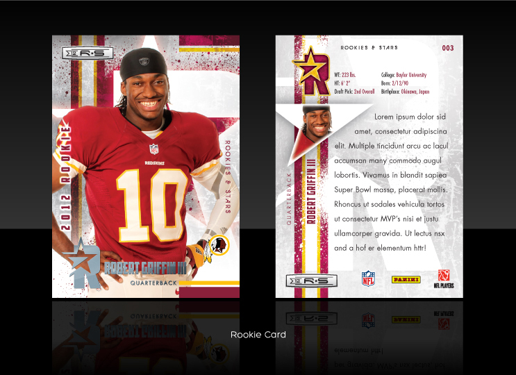
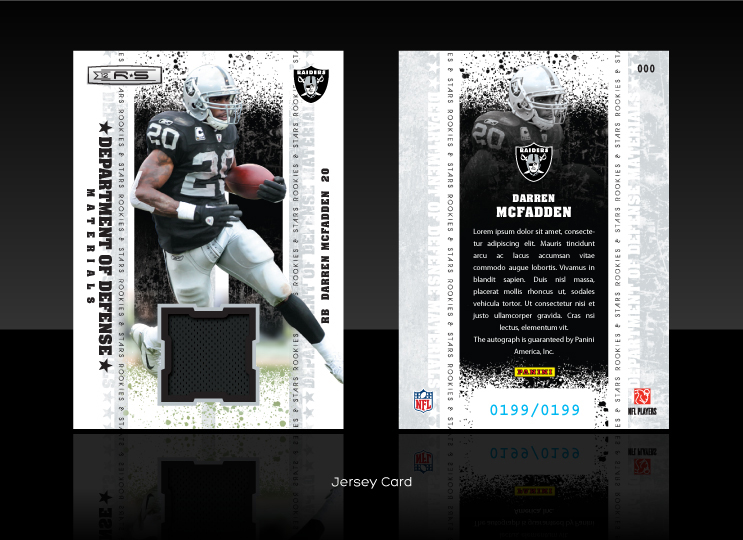
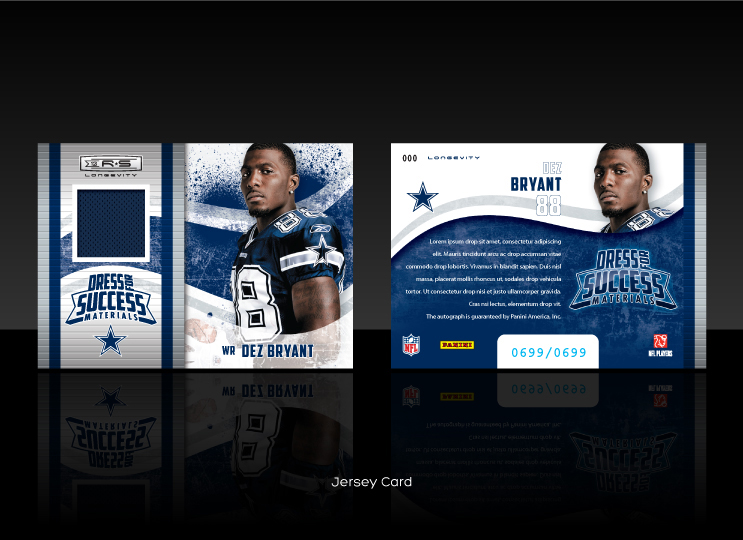
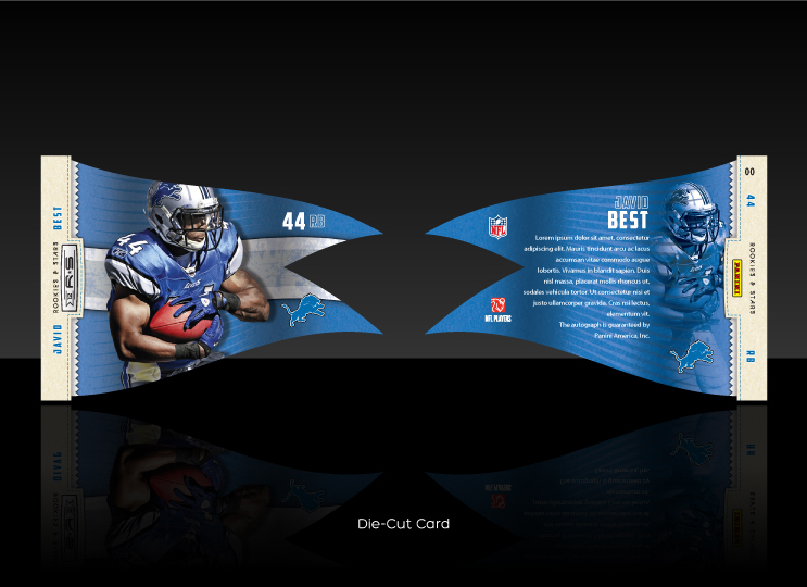
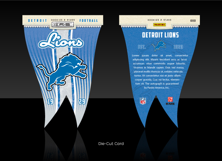
This project was for Panini America (formerly Donruss) doing something very familiar, designing trading cards. This gig was for their upcoming 2012 NFL Rookies & Stars brand. My initial task was to create the look and feel of the set. They wanted something different and more dynamic than year’s past. After a few rounds we were able to establish a look and dive into the rest of the set. The whole set was outsourced and I was able to work with some old coworkers from Upper Deck (which was very cool). We definitely had a talented bunch there. The above slide show are just the cards I designed.
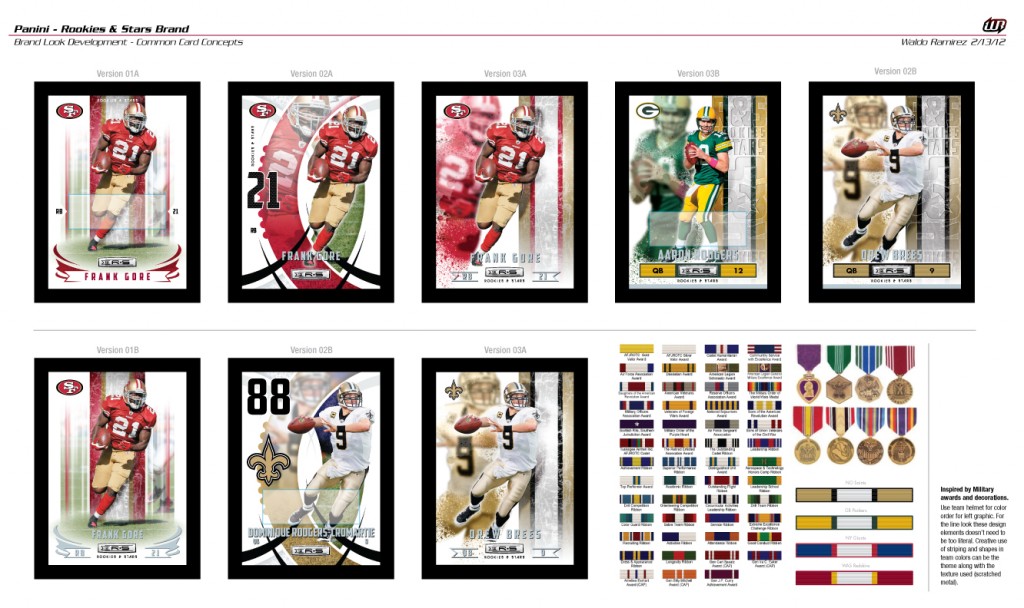
The above image (click to enlarge) shows the other concepts and possible directions for the line look. The last four cards on the right are from the final rounds creating variations of the chosen direction. This direction was inspired by a mixture of military striping on insignia, badges and awards and the football striping on jerseys and helmets. I wanted to go further with the military insignia direction for the inserts and subsets. I thought the awards would make for great die-cuts for jersey swatches and the ribbons and medals would be perfect for team color opportunities and clever logos for insert card titles… but the art director wasn’t feeling it.
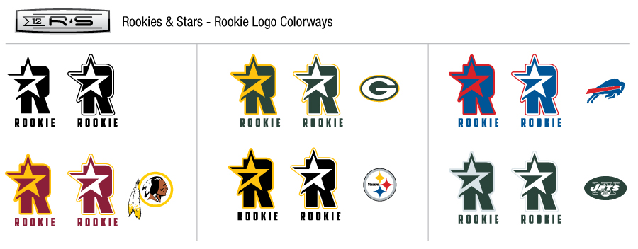
The image below shows the R&S logo I developed for the Rookie Cards (and how they would shift for the different team colorways). The last image is just a shot of my favorite common card concept I developed for the project (maybe next time).
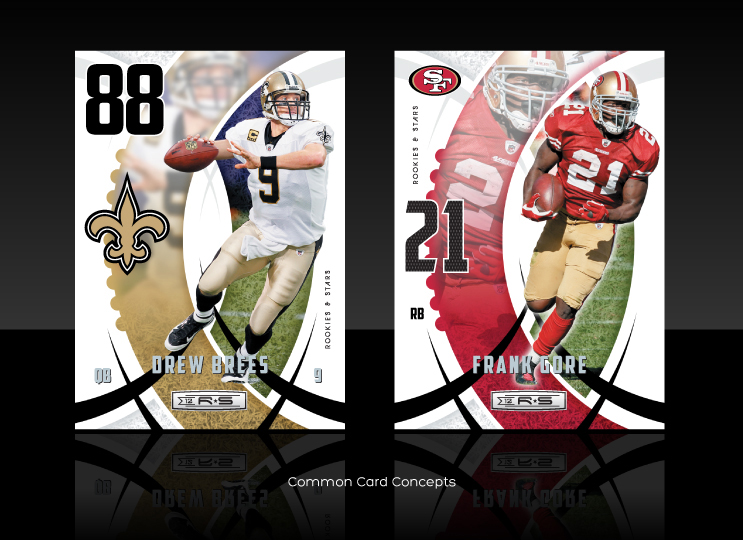 Overall the project went smoothly. It was great to jump back into trading cards again. It’s always cool to design sports collectibles that some kid may (hopefully) cherish. Besides… it’s the NFL! When I get a chance I’ll add some old card designs to my site.
Disclaimer: The mocked up Raider and Cowboy cards were not by choice. They were player images given to us to use for the comps. Hail to the Redskins!

