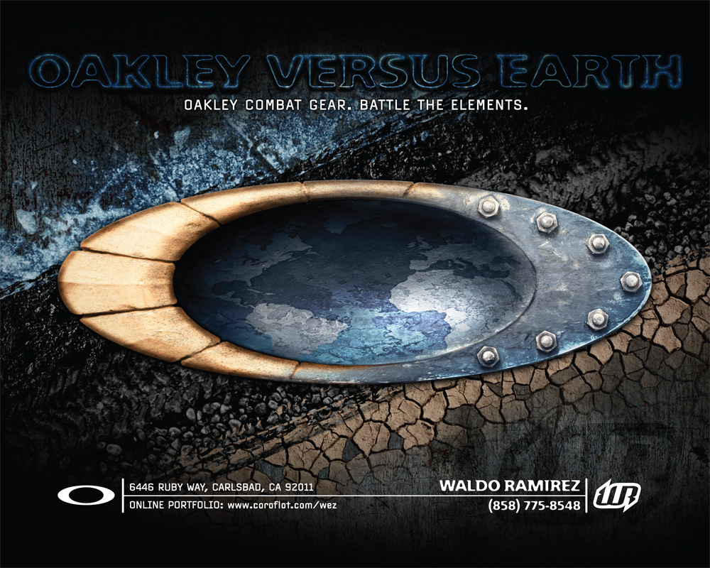
From the harshest arctic conditions to brutal desert sandstorms and everything in between, Oakley is the gear to combat every element Earth can muster! Oakley versus Earth. That was my campaign slogan for this self promo targeting this icon of a brand. I then tried to convey that in the cover design. The Oakley logo is suppose to represent human ingenuity. The bone and metal treatment to the “O” logo symbolizes man and man-made materials as it tries to control the Earth (the globe inside the logo) while battling all the elements in the background. Okay, nevermind all that stuff… as one of my past Art Directors always said (with a Hawaiian Pidgin accent), “Just make look nice!”
To view the entire promo click the arrows (above), swipe (touchscreen) or use the arrow keys (keyboard).
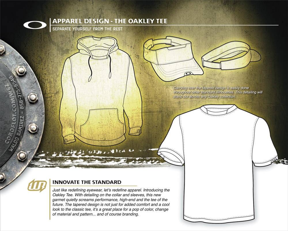
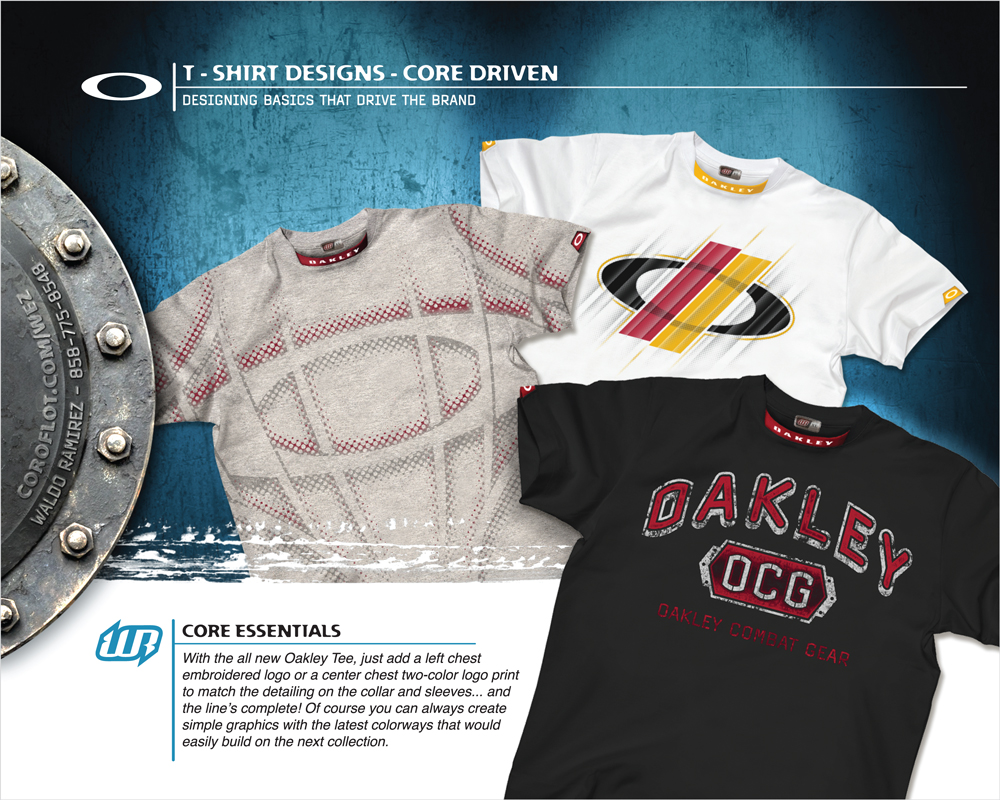
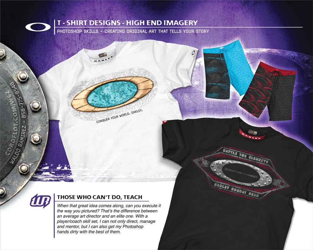
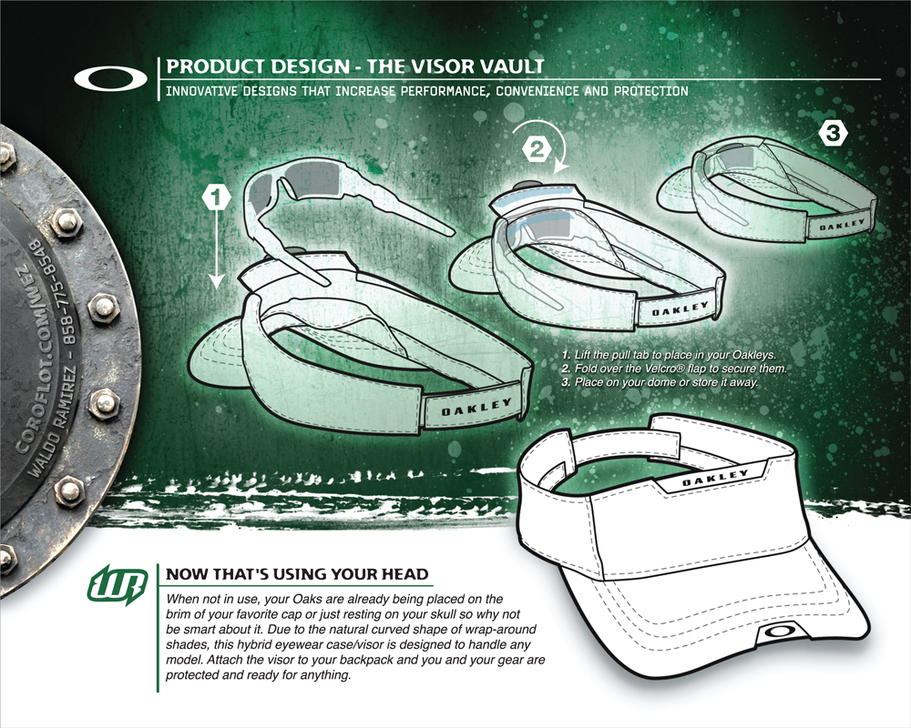
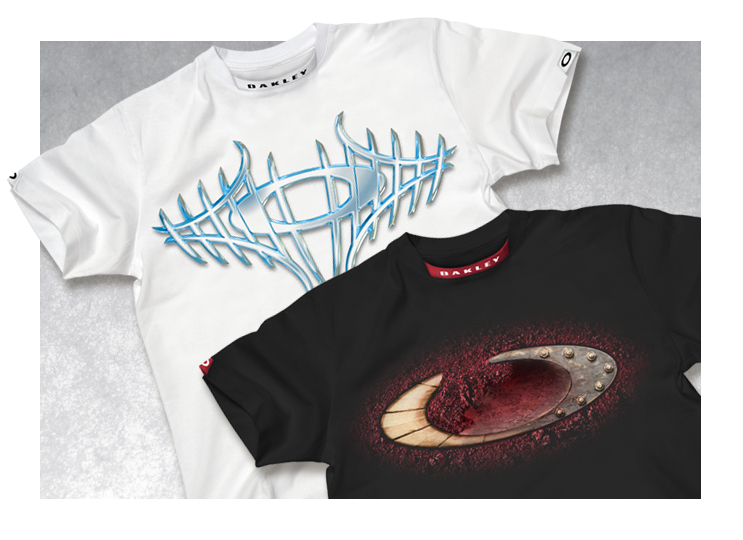
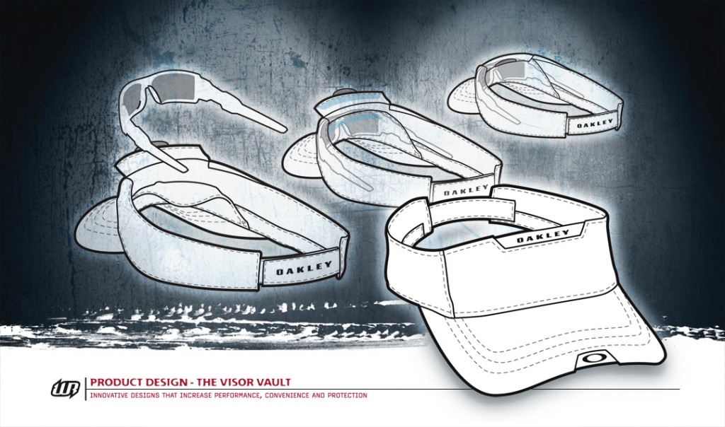 Besides creating typical graphics I wanted to take it a step further. I created a whole new silhouette, the Oakley Tee. In this concept the garment would be their standard tee with detailing in the collar and sleeves designed for better comfort and flexibility. And it just so happens to be a great area for branding. I also drew up a hoodie and a visor that carries through the look. Speaking of the visor, the Visor Vault also doubles as your sunglass case. Most people rest their shades on the brim of their hats anyways… I think it’s time to call Shark Tank! Below are some designs on the Oakley Tee that didn’t make the cut for the promo.

