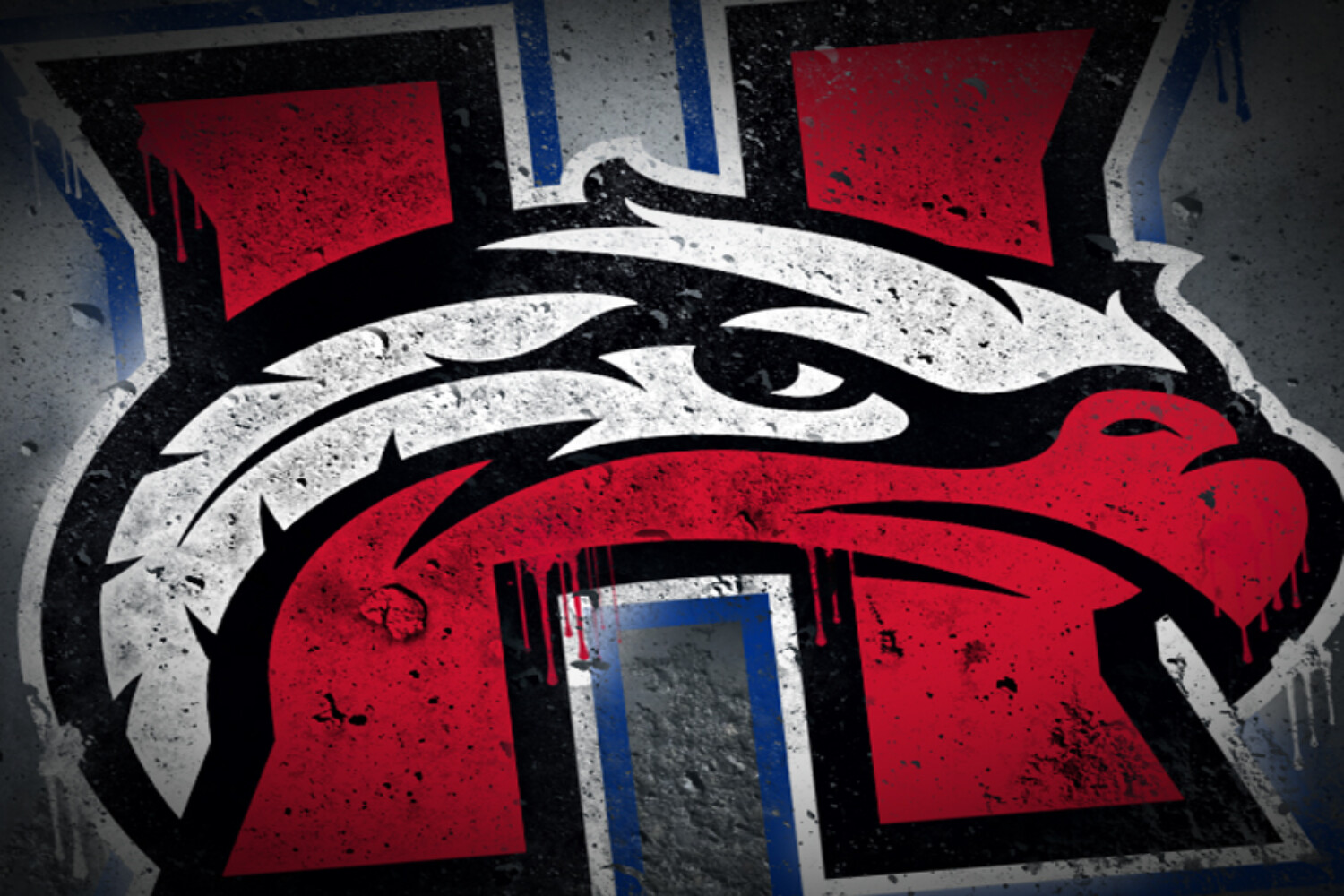
After some brainstorming and reviewing the creative brief we were ready to begin. There were some set ideas on various directions but the client also wanted to see my interpretation of the brief as well.
The Creative Process
In the initial rounds I shared my research and began designing against the directions we discussed: an LA Clippers rehash, a Seattle Seahawks inspired look and my own personal take with the brief. The designs where I saw the most promise I developed further to help the client visualize the solution and speed the process.
Here the client and I were on the same page. The gamble I took to spend more time developing the stronger looks paid off. I also shared some of my inspiration: a spiritual meaning of a hawk and the symbolism of the it’s feathers. I expressed how this relates to the point guard position, his concept of coaching and basketball in general. Not completely sold on the “hawk feather symbolism” or at least how I incorporated this into this round of designs, we had a definite direction to move forward with.
I took the client’s comments and continued to push further. I also wanted to show another concept using the hawk head with the letter “H” that better highlighted the feather concept. Next, I explored the colors and presented a couple logotype ideas. With minor tweaks and final approvals I created their new style guide. The client was so happy with the solutions he chose three designs with the primary logo being the “H” with the feather. I love the look and attitude of the final solution and the fact it met all of the criteria of their creative brief. This project was a blast to work on.


