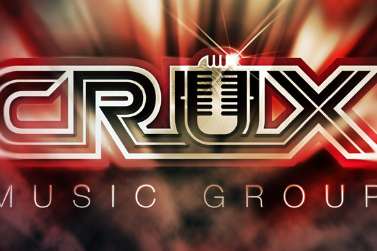
After initial conversations and reviewing the creative brief it was clear they were going to be great clients to work for. Having clients with a deep understanding of who they are and what separates them from the competition are always good starting points. But the fact they put a premium on their branding and entrusted me with full creative freedom makes for a perfect formula for any designer. Now having full creative freedom is a lot of power and as Spidey’s Uncle once said, “with great power comes great responsibility”. I still tried to ask the right questions, be a good listener and use the brief as a guide towards the perfect solution… for them, not me. So even though I was given super powers, they were involved every step of the way.
The main points of direction:
-
- Use “CRUX” as the main focal point with “Music Group” underneath.
- Keep it clean, strong and professional (other keywords: unique, edgy, original).
- Have the cool factor yet stay away from a trendy hip hop look.
- Use the UNLV colors (scarlet red, black, white and grey).
Finally, we discussed the origin of their company’s name, Crux. This was something that wasn’t in the CB but ended up being important to the final design solution. Crux is one of the smallest constellations yet one of the brightest. It comes from the latin word for “cross” and is commonly known as the Southern Cross constellation (design-wise they wanted to stay away from crosses). Erin explained, “…we see ourselves surrounded by all the other people in the industry and we understand that in order to succeed we need to shine brighter than all those around us”. I loved the meaning behind their name and wanted to show this in some of my initial concepts.
Above are images from researching existing studios, general music icons and related packaging. And below are the rounds that lead to the final logo. Click images to enlarge.
And here is the final solution. This concept was the resounding choice among the partners and their inner circle. The spirit behind the company’s name gives a deeper meaning to this logo and makes for a great story.
“Waldo is extremely creative and can take your idea and truly bring it to life. We’ve had an opportunity to work with several graphic designers in the past but Waldo’s combination of talent, professionalism and attention to detail is above and beyond every other designer we’ve worked with. He is now our “go-to” designer. Waldo has a superb eye for quality and a unique workflow/design process which keeps you included throughout the project.” – Chips Weldon and Erin Villanueva, Crux Music Group
Finally, as with all my logo projects I supply a style guide. It shows how their new logo should be used and how it shouldn’t. We wanted to keep the inner star as prominent as possible to stay true to the concept. This file will be a simple way for CMG to share with vendors and police their brand.


