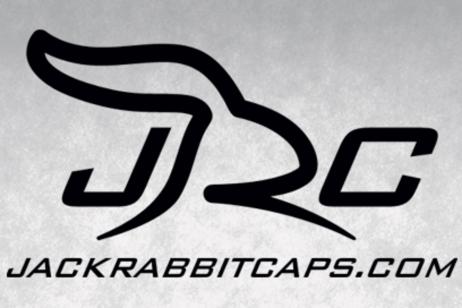
When I received the call for this project I was excited for two reasons. First, it’s always great to take part in developing a new brand. It definitely gets my brain spinning with possibilities. Plus, when you can get excited about the subject matter (athletic apparel), all the better. The second reason was that I knew and have much respect for the founders of JRC. Steve and Michael were both coworkers of mine back at my old gig at Upper Deck.
After they completed the creative brief (CB), Steve also sent images that he googled to show where he didn’t want the direction to go (shown in the research boards below – in the upper right). I love when clients give me as much information as possible, even when it’s what not to do. It helps narrow the creative direction where I can be more effective with my time. Below are my research boards (click to enlarge).
 The overall direction on the CB was to focus more on a rabbit’s characteristics, specifically the ears or the foot (not a full body). Additionally, aligning with the brand image, be sure to not create anything with a cartoonish feel. The last tricky part of this project was to design a logo that works as 1) a full logotype design, 2) with just the “JRC” initials and 3) the logo mark as a stand alone. As most designers know, that’s a tall order. However, now I was ready to begin.
“A well-structured and thoughtful creative process is the foundation to all great design work. Waldo Ramirez has developed a refined process that ensures a smart exchange of information. This not only decreases back-and-forth but allows for highly-tuned deliverables. Thanks to Waldo’s design work, JackRabbit Caps now has a tangible brand identity that matches our business spirit.” – Steve, co-owner, JackRabbit Caps
After quite a few attempts I realized developing a logo mark with just “ears” didn’t work. No matter how hard I tried, drawing rabbit ears either looked too cartoonish or too Playboyish (I’m almost positive that’s a word). When I pursued the “rabbit’s foot” idea… it wasn’t any better. Some versions were just plain indistinguishable while others (more realistic to compensate) just wasn’t right for a logo (way too complex). Even in my research to find references to draw a rabbit’s foot was a little unsettling. I wanted a clean icon, a dynamic logo and not a body part from a poor unlucky bunny. Finally, I had more success in illustrating a head of a rabbit. Easily recognizable and not cartoonish. Playing around with this head graphic and the company’s initials (JRC) things seemed promising. Below are some of the initial versions with the chosen head graphic.
 In the final round it was more about determining which font Michael and Steve liked best with the rabbit graphic. Since the target audience is an affluent runner who doesn’t mind spending a little more for custom-made gear and keeping in mind the keywords chosen in the CB (clean, unique, serious, original, fast) that’s the direction I went. In the end, both owners were happy with the final solution as they felt it hit everything the CB asked for. The creative process is always more effective when you have clients who not only know what their brand is about but respect and allow the creative guys to help them realize their vision.
Thanks to Michael and Steve for their generous comments and allowing me to share their photos.
Below is the final Logo Style Guide.


